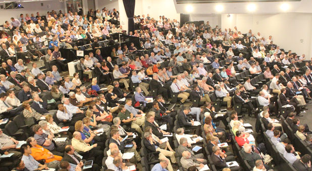
I have had the privilege of being at the Sydney Anglican Synod for much of the last week or so. It has been a wonderful time in so many ways. I am delighted that we (the synod) has been able to “see the crowds” and act accordingly. Archbishop Raffel has chaired well. There has been humour. We have covered a lot of ground. New synod members that I have spoken with have enjoyed it. And there are many other positive and encouraging things that could be said.
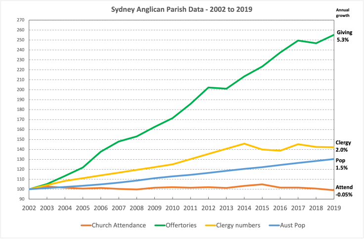
Yet, I have had a growing sense of ….. err…. something concerning over the course of the synod. It was in 2016 that I presented a confronting graph to the synod. It showed that, despite substantial offertory growth, Sydney Anglican Churches had an annual attendance growth rate of just 0.1% over 13 years.
I have now updated this graph, as shown above. Over the 18 years (until 2019), despite annual giving increases of 5.3%, the number of people (adults) coming to church has started to decline. This is despite an increase in the Australian population of 30% over the same period. Many suspect that the data (once available) will show a notable decline (perhaps 10-20%?) after COVID. Interestingly, this data was not presented nor available in any report.
I will leave it to you and others to speculate on the reasons and factors. I am just putting this data out there. It is critical that we confront the data, even confronting data. It is the first step to grappling with the current realities, that, with God’s help, should then spur us into action to reach the nations for Jesus, beginning in our own backyard.
One caution is worth bearing in mind, and that is the default tendancy to rationalise the data away: we are doing better than everyone else; it’s been a tough time, let’s not discourage people; the world is changing; etc. How can we help one another get past natural defensiveness? All of these things may well be true, however, at the same time, the Apostle Paul provided a challenging example:
22 To the weak I became weak, to win the weak. I have become all things to all people so that by all possible means I might save some. 23 I do all this for the sake of the gospel, that I may share in its blessings. 1 Corinthians 9:22–23 (NIV)
A great starting point would be to turn to the Lord of the harvest in prayer. But what should, with God’s help, be next?
I find myself haunted once again with the words of friend many years ago: “The Anglican Church seems to be good at managing slow decline.” May this not be the case on our watch.

So let me get this straight… The “concerning” thing at Synod is that *your* graph wasn’t mentioned? err…
LikeLike
Oh. No, my point is that the Synod has not been talking about our plateau. I don’t mind in what way that happens, or on what basis. But there does seem to be a lack of awareness on the serious issue.
LikeLike